- UI Collective
- Posts
- Blank Canvas: The Art of White Space
Blank Canvas: The Art of White Space
New Content & Mastering Negative Space in Design: Less Noise, More Impact

Kirk McNeill
October 22, 2024

Hello UI Collective Community,
Welcome to the newest format of the UI Collective newsletter! 🎨✨ We’re excited to share that we’ll be covering common design topics a couple of times a week, making our newsletter even more informative and valuable for you. From the latest in UX trends to deep dives into design systems, expect insights and tips to elevate your skills and keep you in the know.
Before we begin, here’s an exciting update on our ‘Build a Design System’ series:
Build a Design System Part 5: Table Components
The latest episode of our popular ‘Build a Design System’ YouTube series is now available. Click the button below to check out how we build scalable table components!
In this week's exploration of one of design's most powerful yet often underappreciated elements: white space. Also known as negative space, this seemingly 'empty' area is anything but void. It's a crucial tool that can elevate your designs from good to extraordinary. Let's dive into the world of white space and discover how it can transform your work.
The Power of Nothing
"Perfection is achieved, not when there is nothing more to add, but when there is nothing left to take away."
This quote beautifully encapsulates the essence of white space. It's not about what you add, but what you consciously choose to leave out. In our cluttered digital world, the strategic use of white space can be a breath of fresh air for your users.
White Space: More Than Just 'White'
Despite its name, white space doesn't have to be white. It's any empty area in your design, regardless of color. Think of it as the pause between musical notes or the moments of silence in a conversation. These 'empty' spaces give meaning and structure to the elements around them.
The Benefits of Embracing the Void
White space isn't just about aesthetics; it serves crucial functions in design:
Improved Readability: Adequate spacing between lines and paragraphs makes text easier to read and comprehend.
Enhanced Focus: By isolating elements, white space draws attention to what's important.
Better Organization: It helps create logical groupings and hierarchies within your design.
Increased Elegance: A generous use of white space often conveys a sense of luxury and sophistication.
"White space is to be regarded as an active element, not a passive background."
Practical Application: The Apple Approach
Apple is renowned for its masterful use of white space. Their product pages are a testament to the power of simplicity. By surrounding their products with ample white space, Apple creates a sense of importance and luxury around their devices.
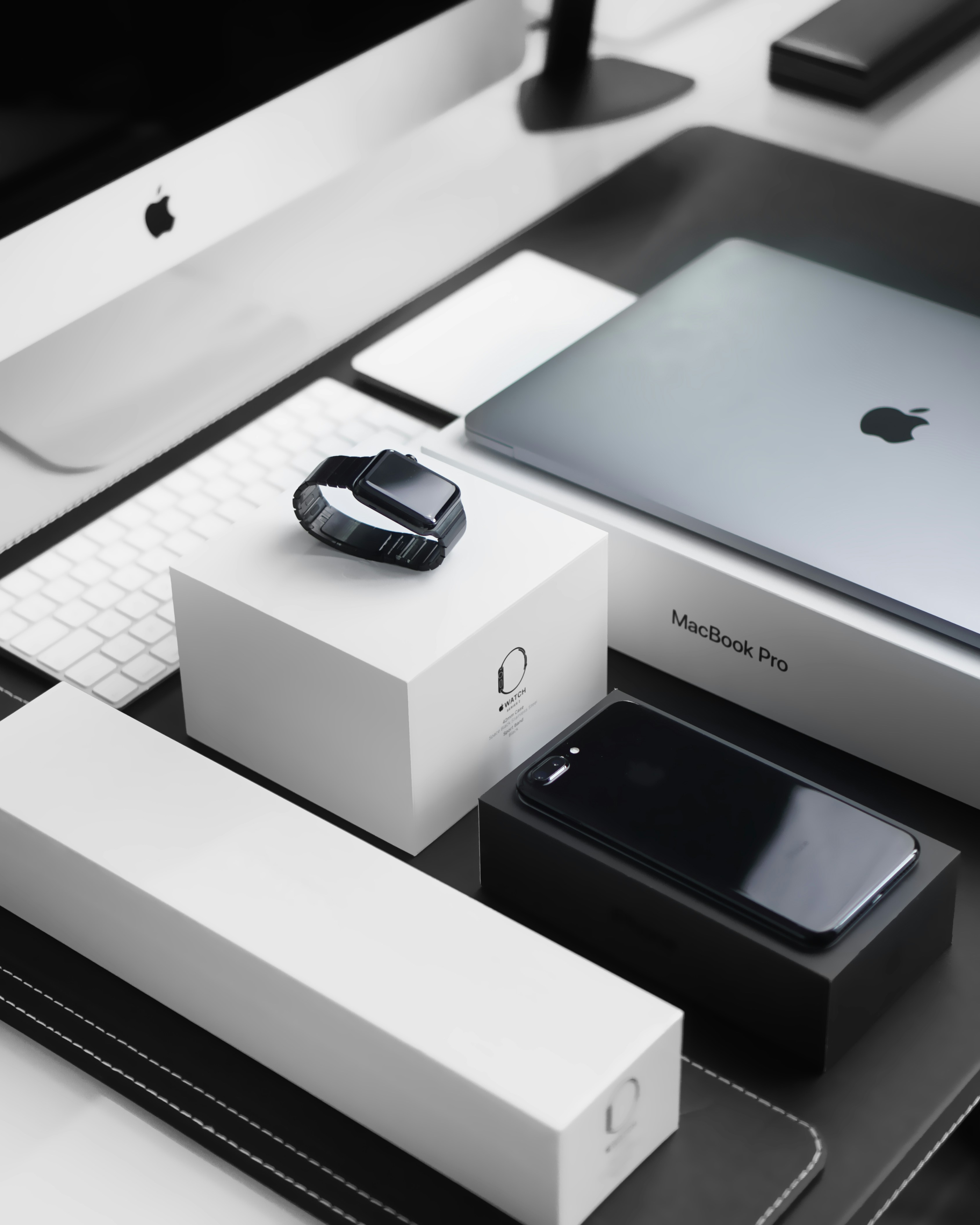
This approach doesn't just look good; it works. The focused design helps users concentrate on the product without distractions, potentially boosting conversion rates.
White Space in UX: Breathing Room for Better Experiences
In UX design, white space is not just about visual appeal; it's about creating better user experiences. Proper use of white space can:
Reduce cognitive load
Improve navigation
Enhance content digestibility
Create a sense of balance and harmony
Consider how white space affects the scanning patterns of your users. Eye-tracking studies show that appropriate use of white space between paragraphs and in the left and right margins can increase comprehension by almost 20%.
Balancing Act: When Less Isn't More
While white space is powerful, it's important to strike a balance. Too much white space can make a design feel incomplete or disconnect related elements. The key is to use white space purposefully.
"To create, one must first question everything."
Question every element in your design. Does it need to be there? If you remove it, does the design become clearer or more confusing? This critical thinking will help you find the perfect balance.
Your Turn: The White Space Challenge
This week, we challenge you to:
Audit one of your current designs. Where can you increase white space to improve clarity and focus?
Create two versions of a design: one cluttered and one with ample white space. Ask colleagues which one they prefer and why.
Find examples of effective white space use in everyday life (not just digital designs). Share your discoveries with us!
Further Reading
To deepen your understanding of white space:
"White Space Is Not Your Enemy" by Kim Golombisky and Rebecca Hagen
"The Elements of Typographic Style" by Robert Bringhurst
Negative Space in Design: https://www.interaction-design.org/literature/article/the-power-of-white-space
Remember, in the realm of design, sometimes what you don't add is just as important as what you do. White space is your canvas, your breathing room, and your secret weapon for creating designs that truly resonate.
Until next time, keep designing and embrace the power of nothing!
Kirk & the UI Collective Team